

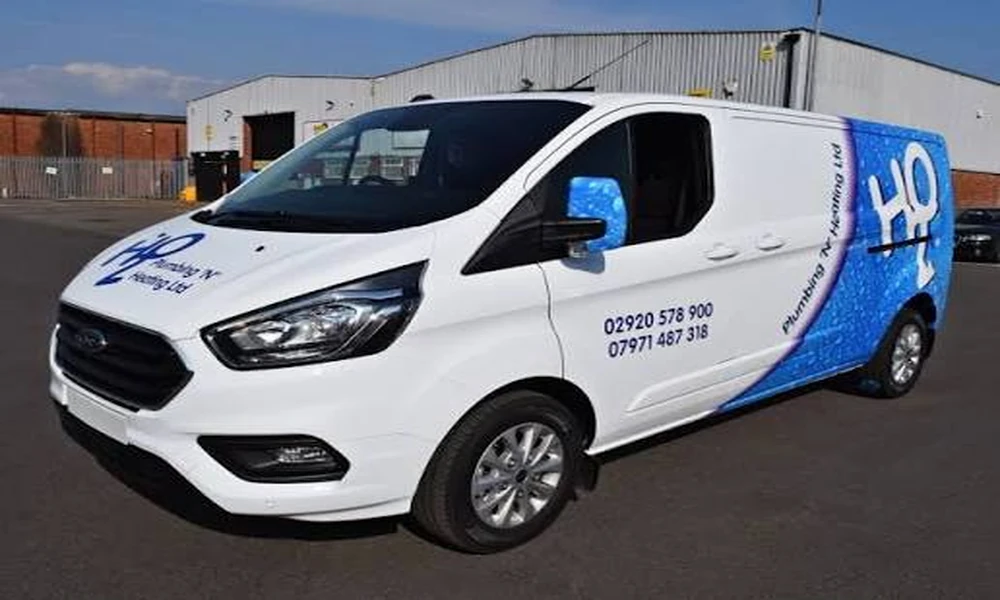
A business vehicle carrying two languages needs each message reviewed as something a customer will understand, not simply as lettering that fills a space. Check the meaning of both versions, then check what survives any shortening for the layout. Equal visual space is not the same as an equal promise, and the person approving the design may need a reader for each language.
Translate the promise before fitting the lettering
Begin with a short statement of what the business actually offers. A vehicle might advertise repairs by appointment, home visits or a particular service category. Decide which information belongs on the vehicle before asking someone to translate it. Otherwise, a translator or bilingual colleague may be asked to solve an unclear business message rather than a language question.
Consider a hypothetical repair business whose English wording says “Repairs by appointment.” A shortened second-language version should not accidentally communicate walk-in availability or an emergency response. Those are different promises, even if all three phrases could look attractive under the same logo. The business owner must establish the intended offer before deciding which wording fits the panel.
The same applies to scope. A message saying the business serves residential customers should not become a broad claim about all types of premises in the other language merely because the shorter wording is easier to arrange. Write down the meaning that must remain intact. It gives the language reviewer something more reliable to work from than “make this sound good.”
Do not ask the graphic installer to infer an unfamiliar language from a reference photograph. Supply the approved text in a usable written form, with any accents, punctuation and intended line breaks identified. The installer can then explain how the supplied wording would be reproduced. Responsibility for what those words mean should remain with somebody able and authorised to review it.
Choose the level of language help appropriate to the message. A simple company identifier and a technical service description may need different kinds of review. Where meaning is uncertain, obtain qualified translation assistance instead of treating an automated output as final approval. The objective is a message the business can stand behind, not a particular method of producing it.
Give each language its own reader
Someone fluent in both languages may be able to review both versions, but tell them to read each independently. A reviewer who already knows the English message can unconsciously supply information missing from the other wording. Ask what a customer reading only that version would believe the business offers and how that customer would know what to do next.
Return to the appointment example. Show the second-language wording without the English phrase beside it and ask the reviewer to explain it back in ordinary terms. If the explanation omits the need to book, revisit the wording. The useful discovery is not that one language needs more characters. It is that an operational condition has disappeared from the message.
Read contact details separately from the service description. A shared telephone number can be correct in both versions while the words beside it imply language support the business cannot provide. Decide what happens when someone contacts the business after reading either message. Do not advertise an effortless conversation in a particular language unless the business has arranged the service needed to support that expectation.
Proper names deserve their own decision. The registered or public business name, a branded service name and an ordinary descriptive phrase are different kinds of text. Ask the relevant reviewer which elements should remain as supplied and which need translation. Avoid letting a designer translate or abbreviate a name simply to make two blocks look symmetrical.
Make corrections precise. If a word changes, supply the complete corrected phrase and identify which earlier version it replaces. Asking for “the accent fixed” without showing the resulting text can leave room for another mistake. The person checking the revised proof should compare the visible characters with the approved wording instead of relying on a quick impression that the paragraph now looks familiar.
Keep that review tied to the actual production proof. Correct text in an email does not establish that the same text appears on the final design. Changes in font, line breaks or emphasis should be checked by someone who can read the language. The business does not have to treat every layout revision as a new translation project, but it should know when a revision affects meaning.
Resolve unequal space without inventing unequal offers
Two equivalent messages may occupy different amounts of space. Treat that as a design constraint rather than evidence that the longer language has unnecessary words. The right response may be a different arrangement, a shorter message in both languages or less supporting information. A person who understands the wording should be involved before text is removed to make a panel balance visually.
In the appointment example, the owner commissioning custom printed vehicle wraps in Mississauga through SRS Tints should withhold print approval if the shorter line loses the booking condition. Supply both complete approved texts and identify the missing meaning. The layout can then be reconsidered with the actual problem visible, rather than sending an instruction to make the second version fit at any cost.
Suppose the original message says “Residential repairs by appointment” but the available space cannot accommodate both full versions comfortably. The owner might choose an equally accurate, shorter statement of the service and leave booking details to a clearly identified contact route. Both versions should then be reviewed again. Removing a qualification from only one can leave two audiences receiving different offers.
A deliberate hierarchy can be acceptable when it matches the business’s purpose. The design might use a shared company name and contact route with a compact description in each language. What matters is understanding the choice and its consequence. Do not assume identical type size alone makes the communication complete, or that every bilingual design must follow one prescribed arrangement.
Keep the final wording available to staff who answer enquiries. They should be able to recognise the service message a caller has read on the vehicle, including the appointment condition. If a later change in the business makes that message inaccurate, arrange a fresh language review alongside the design change. Both versions need to follow the offer as it evolves.
For the final reading, ask each reviewer the same plain question: what would a customer believe this business will do? If the answers agree with the intended service, the languages are doing their job even when their shapes differ. That shared meaning is a stronger basis for approval than a perfectly balanced rectangle of text.
